Family Channel
Bringing Generations Together Through Accesible Design
Developed in 2014, Family Channel set out with a big vision: making social connection through technology easy and inclusive for seniors. With an interface tailored to their needs, the project bridged the digital divide across generations and earned a Red Dot Design Award in Interaction Design, validating its innovative and accessible approach.
Project details
Client
Red Dot Design Award
Project
Family Channel
Year
2014
Services
UX/UI Design UX Research Innovation Discovery
Credits
Mariana Pedroza
Javier Rebolledo
Category
Mobile and Web App
My Role
UX Research, UX Design
Defining the Distance: Problem Statement
As technology evolves at a relentless pace, many seniors find themselves left out. They struggle with new devices and social media platforms not designed for their needs, which can lead to feelings of isolation. This gap deepens the disconnect between younger and older family members, turning technology into a barrier rather than a bridge.
Personal Challenges & Key Takeaways: Discovering the “Why”
In designing Family Channel, we faced the challenge of translating complex digital functions into simple, intuitive interactions. Empathising with seniors’ perspectives required us to set aside our assumptions and dig into their needs.
In Family Channel, my core role was leading user research—a responsibility that defined not only the project’s direction but also its impact. I designed and executed in-depth interviews and observation sessions with seniors, listening to their frustrations and hopes around technology. These sessions uncovered the emotional and practical obstacles that prevent many seniors from engaging with digital tools, insights that deeply influenced our design priorities.
By owning the research process, I ensured that every design choice reflected the users’ real needs, creating a product that was both inclusive and meaningful.
What Would Enable Seniors to Feel Empowered by Technology?
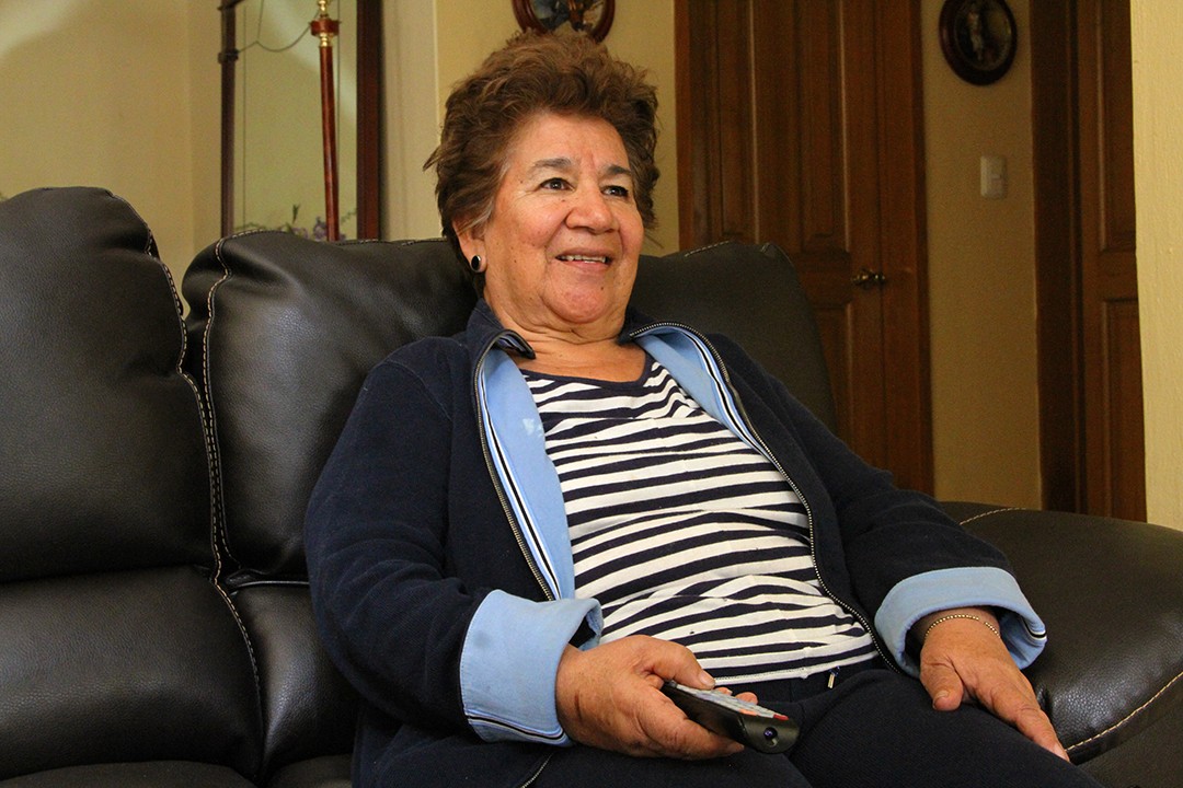
We hypothesised that an accessible design—one that leveraged familiar devices like a standard TV remote—could overcome the barriers seniors face. By prioritising ease of use and eliminating the need for new devices, we hoped to make connection easy, enjoyable, and frustration-free.
Listening Deeply: Research & Discovery
To ground our work in reality, we conducted interviews and observation sessions with seniors, their family members, and care providers. We learned about the physical, emotional, and technological barriers they faced, from limited dexterity to unfamiliar jargon. This immersive research uncovered new design paths and confirmed the need for a low-tech, high-impact solution.
Turning Observations into Actionable Solutions
Our findings showed that small, thoughtful design choices could make a big difference—seniors didn’t just need technology simplified, they needed it to align with habits they already knew. We crafted personas and user journeys based on our research, letting us pinpoint design priorities: simplicity, familiarity, and seamless integration with everyday life.
Seamless Connectivity: Solution & Impact
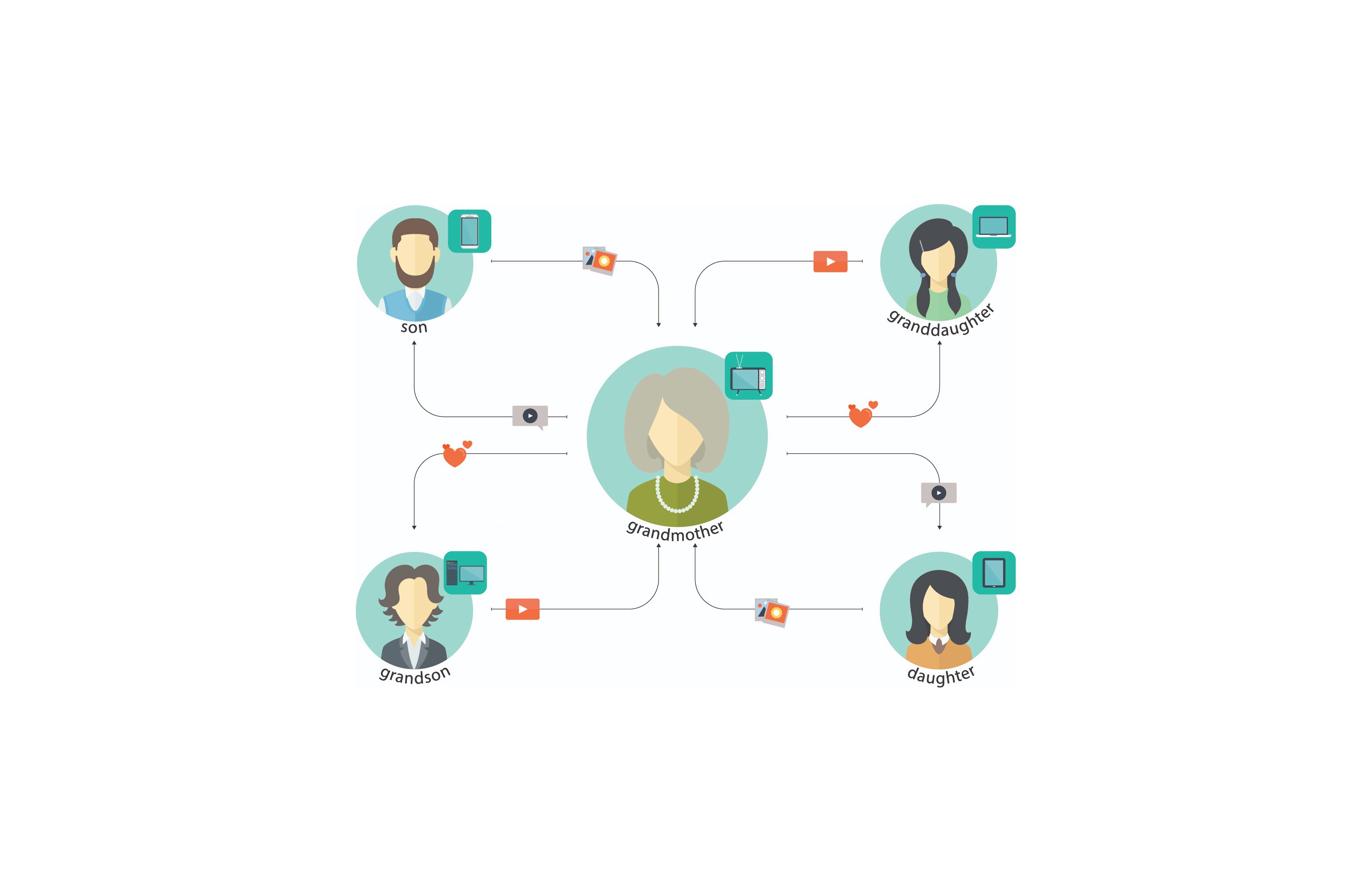
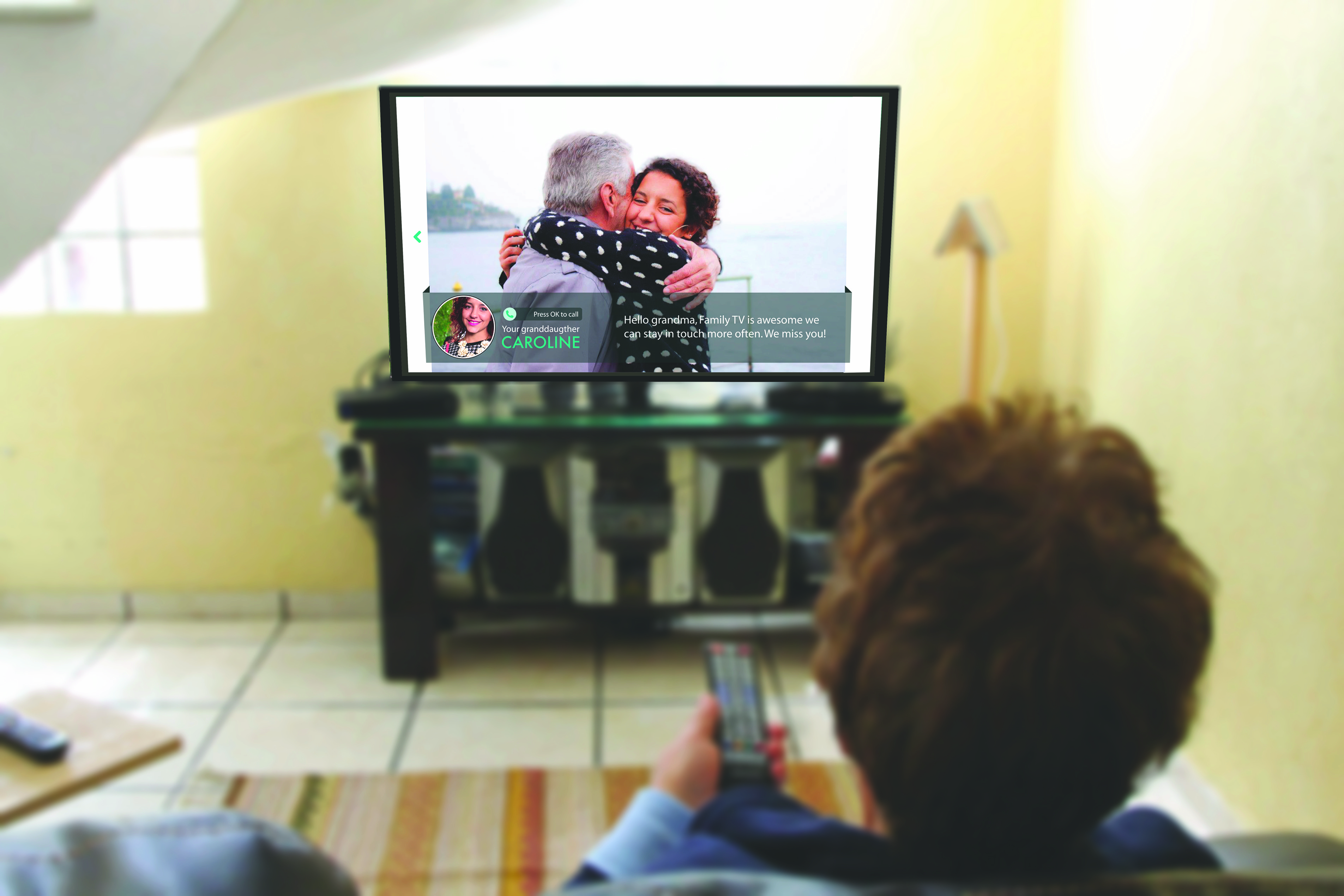
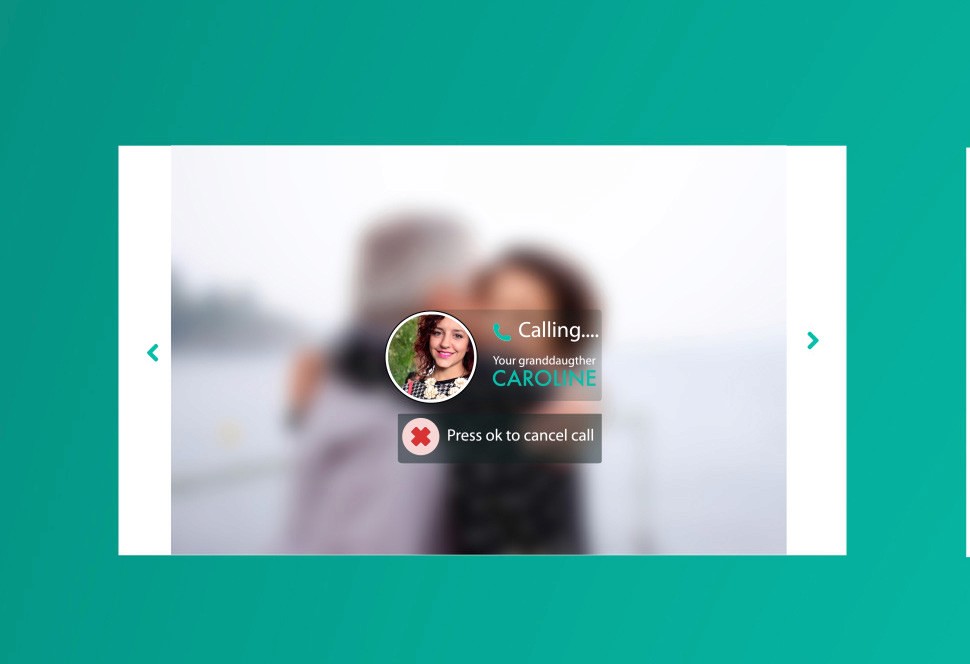
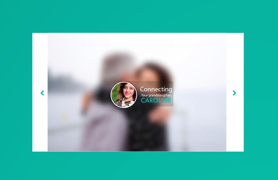
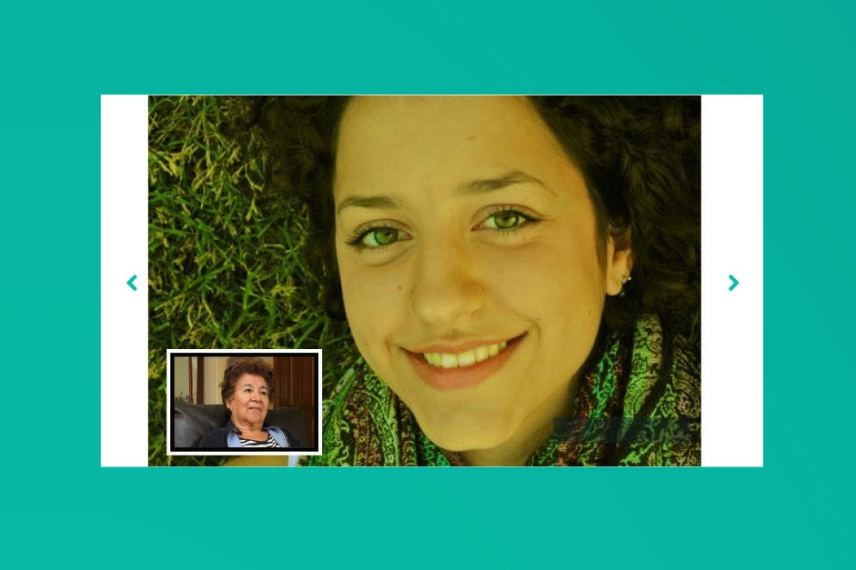
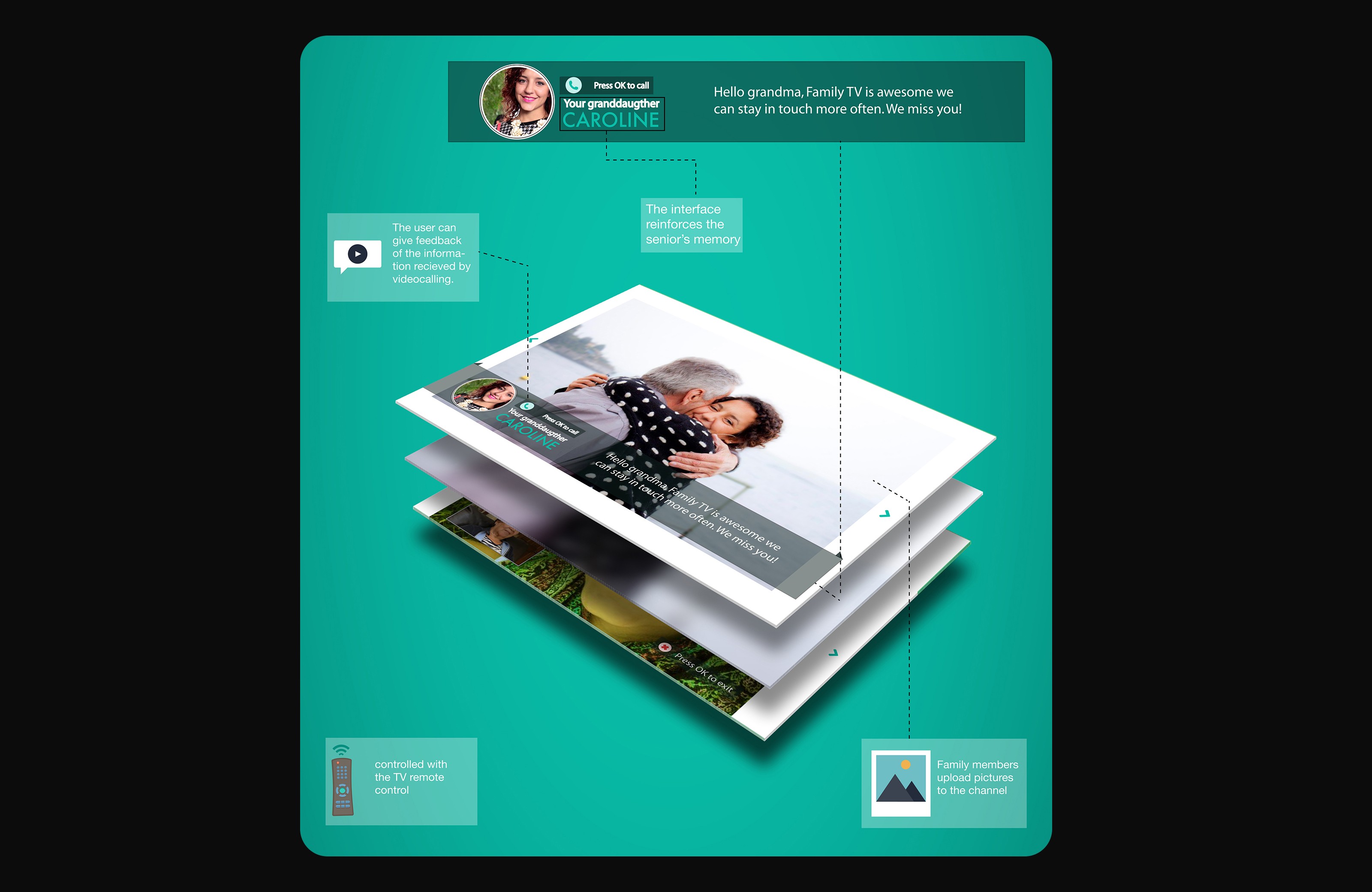
Family Channel was developed to work on any standard TV, using a familiar remote to simplify interaction. A camera enabled video calls, while family members could share photos and updates that seniors could view directly on their screen. This accessible design was an empowering tool for seniors, helping them stay connected without a steep learning curve.
User testing was essential to refine our interface, involving iterative feedback from a wide age range. The results validated our assumptions, revealing that seniors were enthusiastic about learning and connecting through Family Channel. These insights helped us polish the interface and add small touches that enhanced usability.
Reflecting Forward: Summary & Next Steps
Family Channel’s Red Dot recognition affirmed our work, and the success of this project continues to inspire new ideas to bridge generational divides. Moving forward, we see opportunities to expand Family Channel’s capabilities, integrating with even more media and communication tools that make staying in touch as simple as turning on a TV.
This was only a Glimpse.
I would love to share the full version with you. Connect with me on Linkedin or send me a message below.
